
Pick your pack

◉ 12 profiles & LUTs
⊞ sRGB, Rec.709 and DWG
✓ Base presets
⛶ 20 practice raw images
◉ 52 profiles & LUTs
⊞ sRGB, Rec.709 and DWG
✓ Base presets
★ Bonus: 12 cinematic profiles
⛶ 20 practice raw images
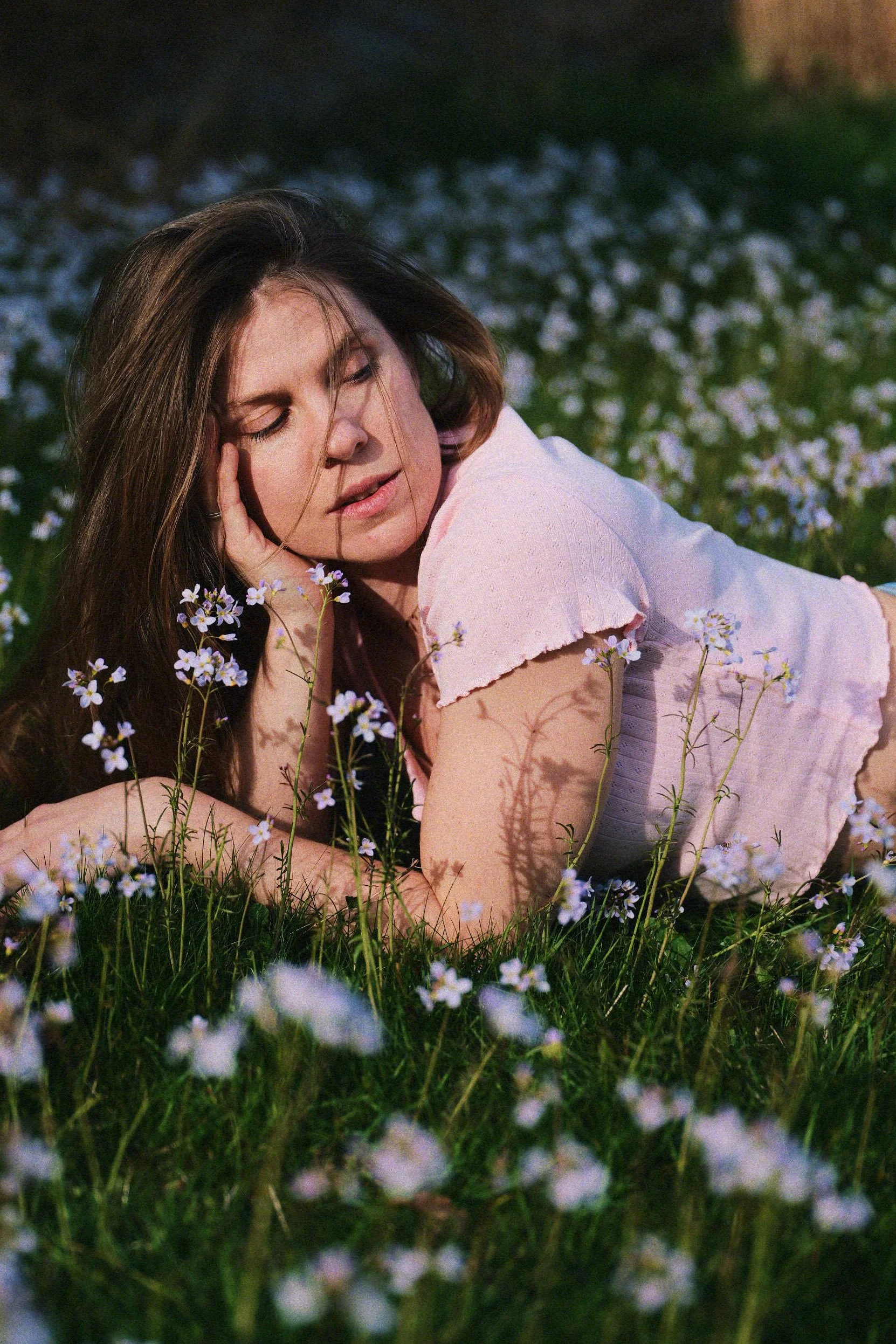
True film simulation
Original → Negative → Positive
Remember photographic paper?
The art of printing a negative onto photographic paper feels like an old memory. Back in the days it wasn’t enough to have a negative, you needed to print the photos on paper. And that’s important. The paper choice was as critical as the film you shot with. But nowadays, everyone digitally scans their negatives, and the beautiful colors of photographic paper have been forgotten.
The modern analog process is handicapped.
Not anymore. Ladies and gentlemen, you can once again choose your positive.
Original Image
The original image is converted into spectral data in preparation for a real film simulation pipeline.
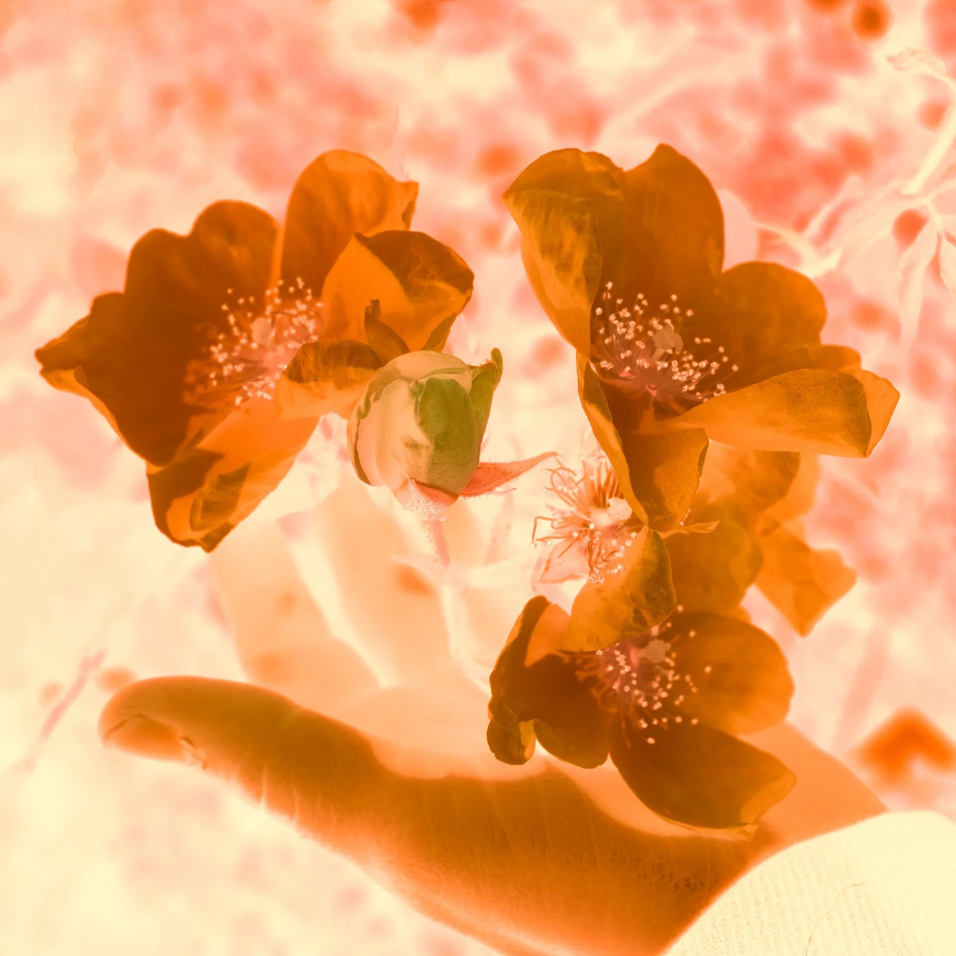
Negative
The negative is exposed to the spectrum and developed. We have 13 negatives to choose from (yes, we profiled Portra).
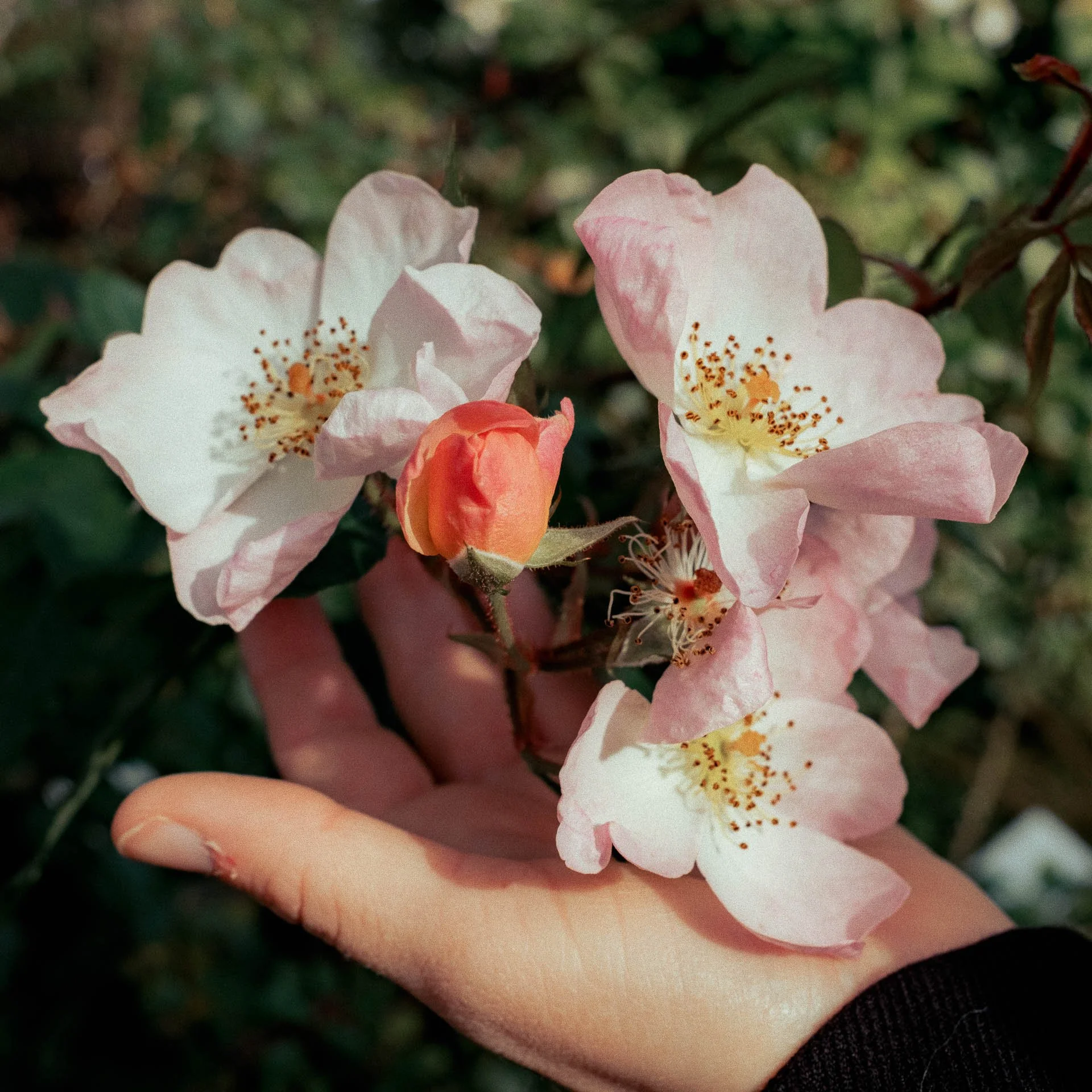
Positive
In a true analog workflow, the positive is where the image comes to life. We have both paper and film positives.
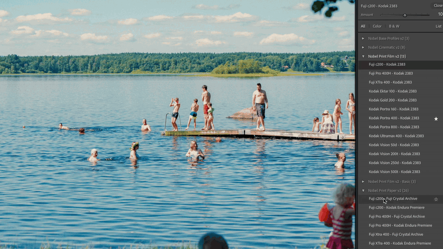
More than presets.
Profiles.
Each one of our 52 profiles simulates the entire analog photography pipeline: negative exposure, development, positive print and development.
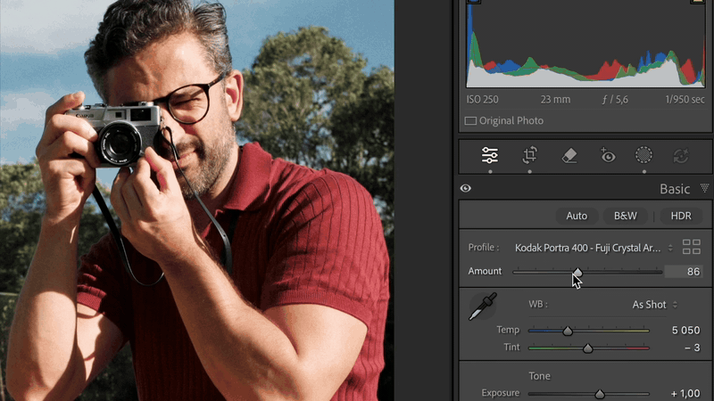
Never overcooked
Use Lightroom’s built-in amount to dial in the precise amount. We do believe you’ll go full strength though.
What’s included
13 Negative Films
-
![]()
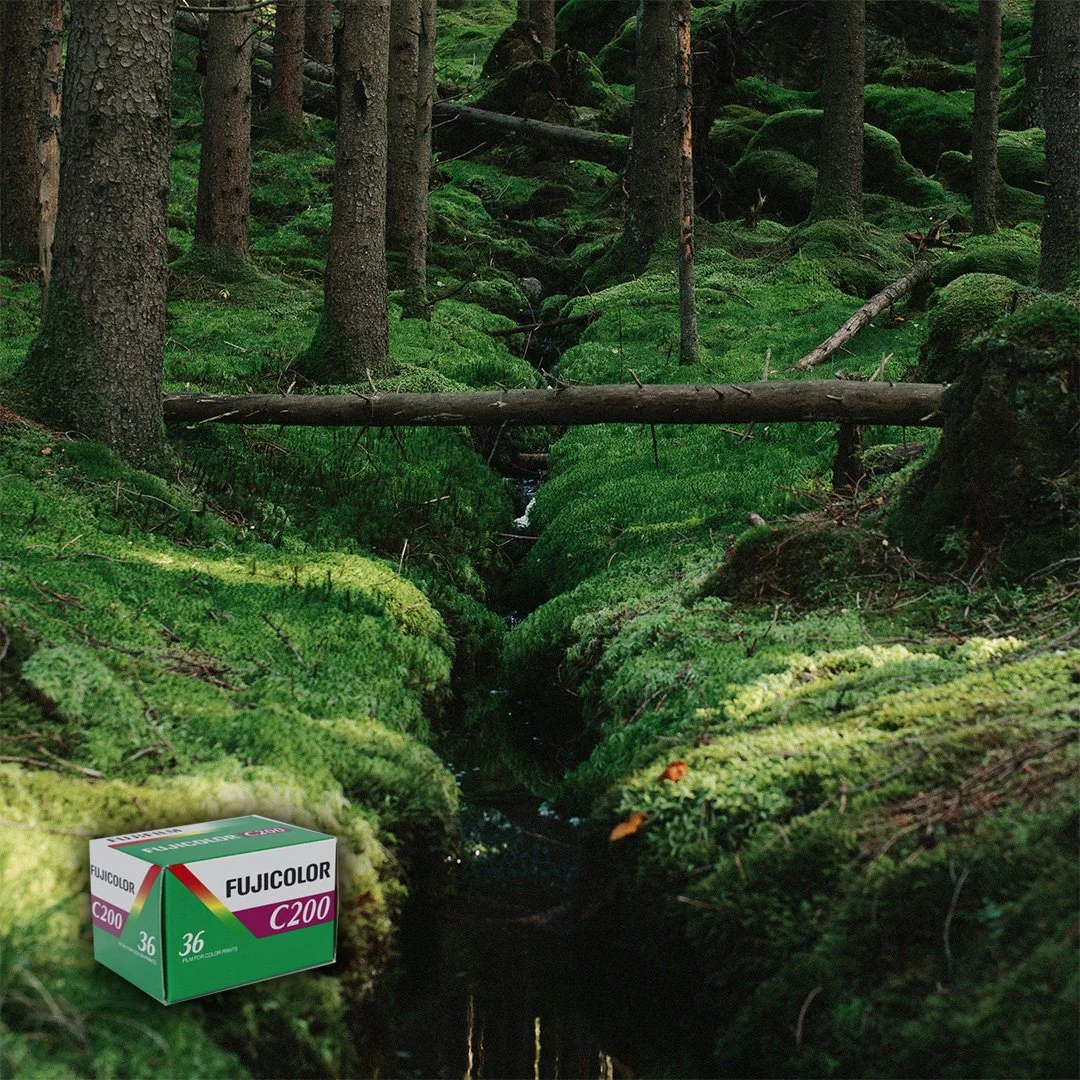
Fujicolor c200
Punchy colors and slightly cool overall. Warm skin tones, moderate contrast, clean highlights, and a moody daylight look. Pair with Fuji Crystal paper to keep that Fuji vibe.
-
![]()
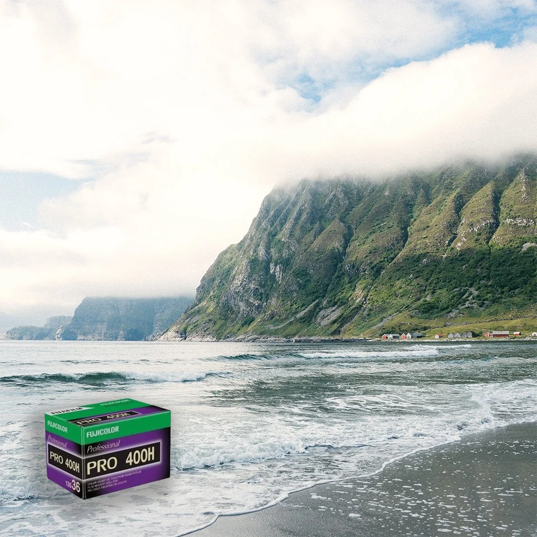
Fujicolor Pro 400H
Soft, pastel palette and creamy skin tones. Minty greens, cool-leaning neutrals. Elegant, muted color separation. Lets the print medium be the dominant character creator.
-
![]()
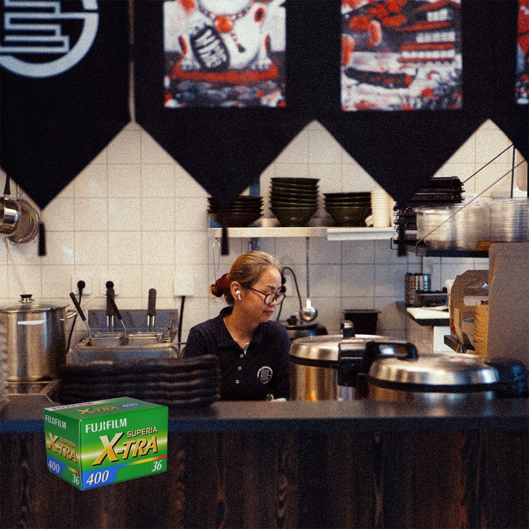
Fuji X-Tra 400
Vibrant and contrasty. Strong greens and cyans, bright reds, slightly cool shadows. Energetic, punchy look with crisp midtones. When using it, remember, more is more.
-
![]()
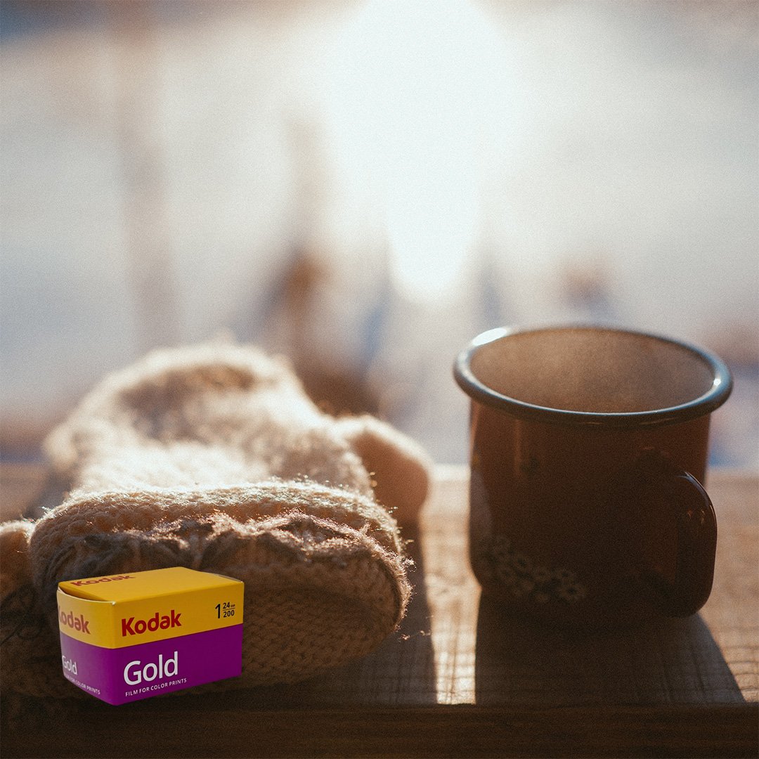
Kodak Gold 200
Warm, sunny colors. Golden yellows and oranges, rich reds, slightly nostalgic palette. Pleasing, warm skin tones. Pair with Kodak Premiere print paper to emphasise the warm tones.
-
![]()
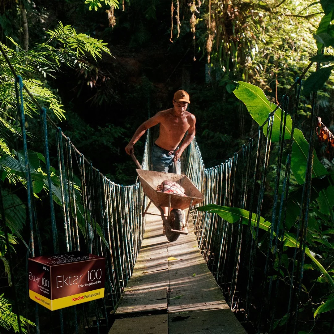
Kodak Ektar 100
Saturated and clean color. Bold reds, deep blues, crisp greens. Very punchy, glossy “postcard” look. Pair with Fuji print paper to maintain color accuracy.
-
![]()
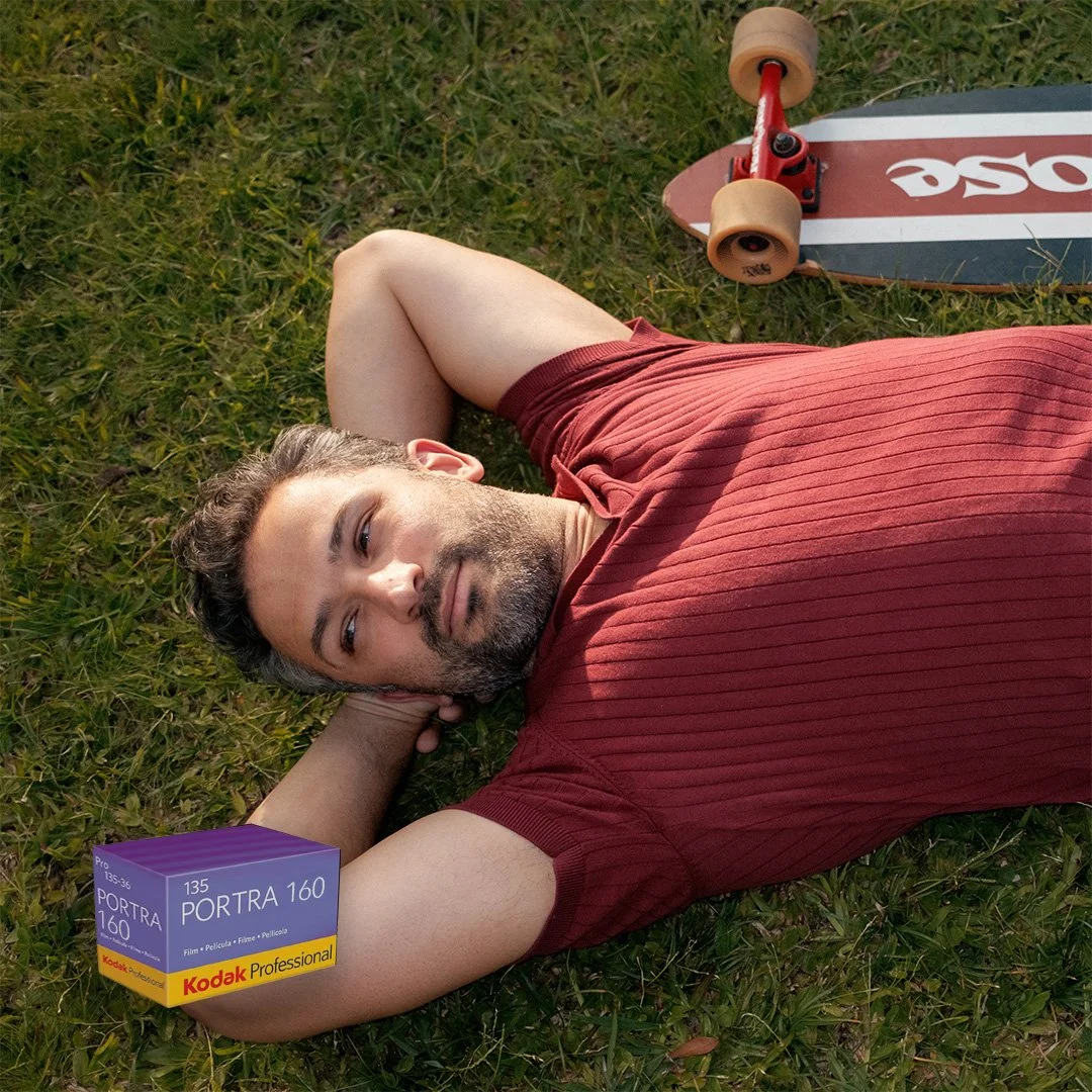
Kodak Portra 160
Natural, restrained colors and soft contrast. Warm-but-neutral skin tones, with gentle saturation and a refined, airy pastel tendency. Pair with Fuji Crystal print paper to keep it subtle.
-
![]()
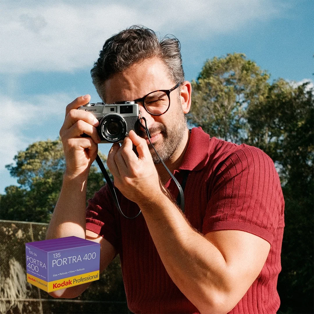
Portra 400
True-to-life color. neutral warmth and smooth tonal roll-off. Restrained saturation that gives flattering, consistent skin tones. Pair with Fuji Crystal print paper to keep greens separate from yellows.
-
![Kodak Portra 800]()
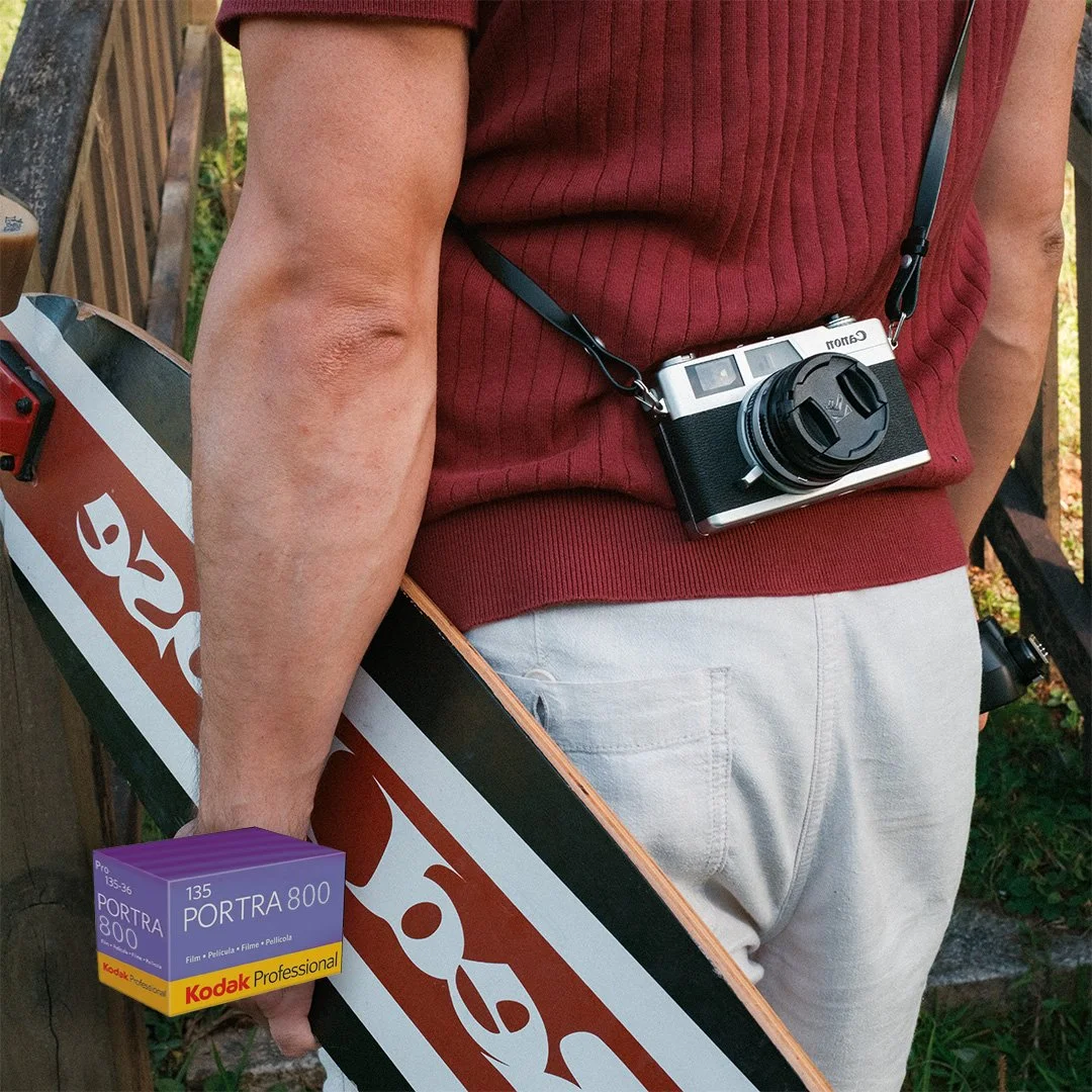
Kodak Portra 800
Warm, slightly saturated color. Strong skin-tone rendering. Lively but not harsh shadows. Pair with Kodak Premiere print paper for extra warmth.
-
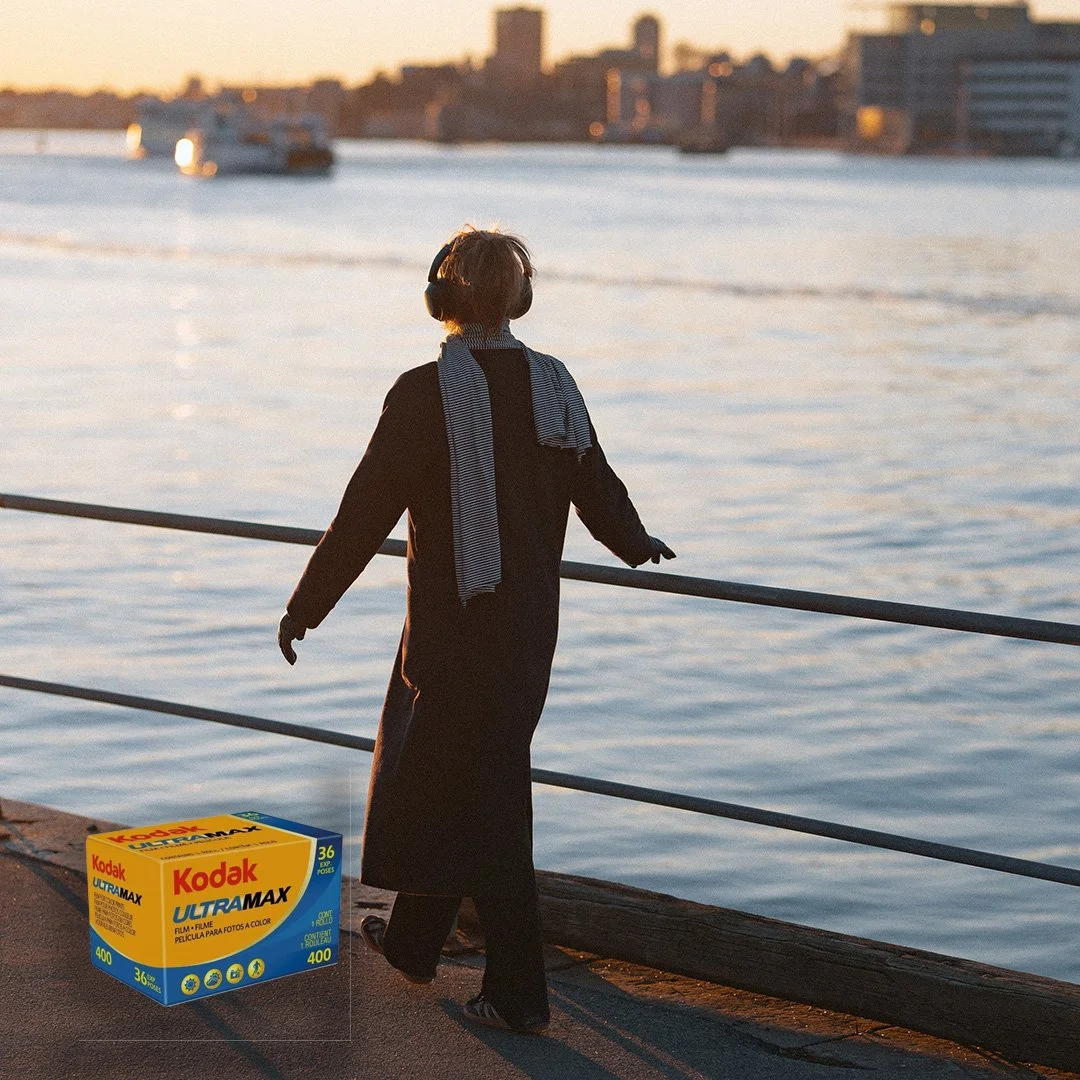
![Kodak Ultramax 400]()
Kodak Ultramax 400
Modern and surprisingly accurate colors with controlled saturation. Energetic daylight and flash vibe. The print medium is front and center here - experimentation is key.
-
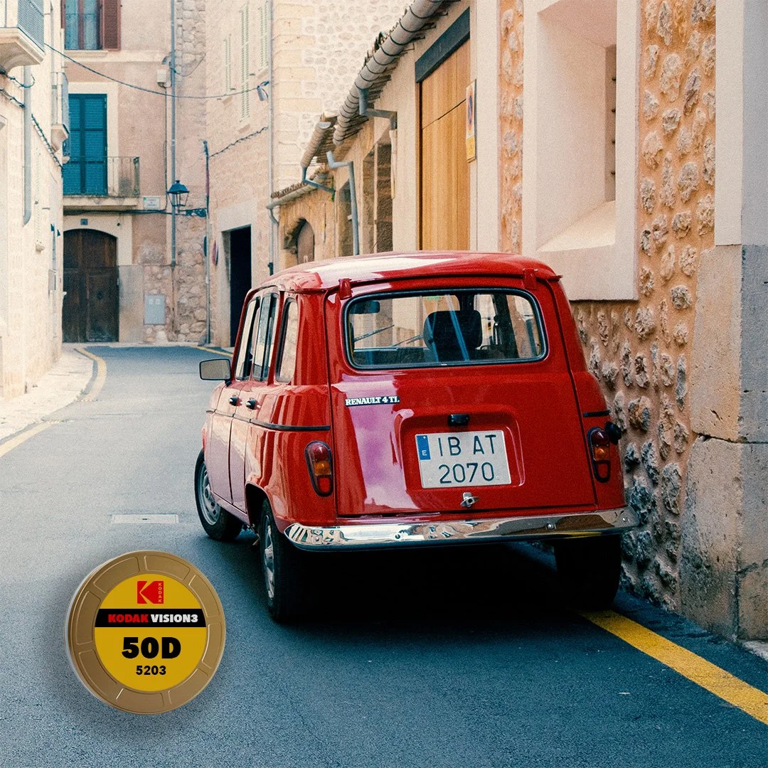
![Kodak Vision3 50D]()
Kodak Vision3 50D
Clean, modern color with tight grain. Color-accurate with controlled overall saturation. Pair with Kodak 2383 for a strong cinematic split tone and colors.
-
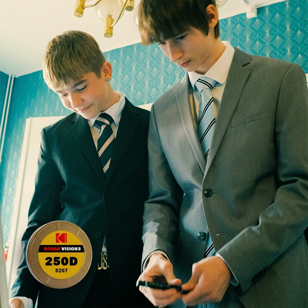
![Kodak Vision3 250D]()
Kodak Vision3 250D
Balanced, filmic color and gentle contrast. Warm highlights, natural greens, and controlled saturation for pleasant skin tones. Pair with Kodak 2383 for an immediate cinematic look.
-
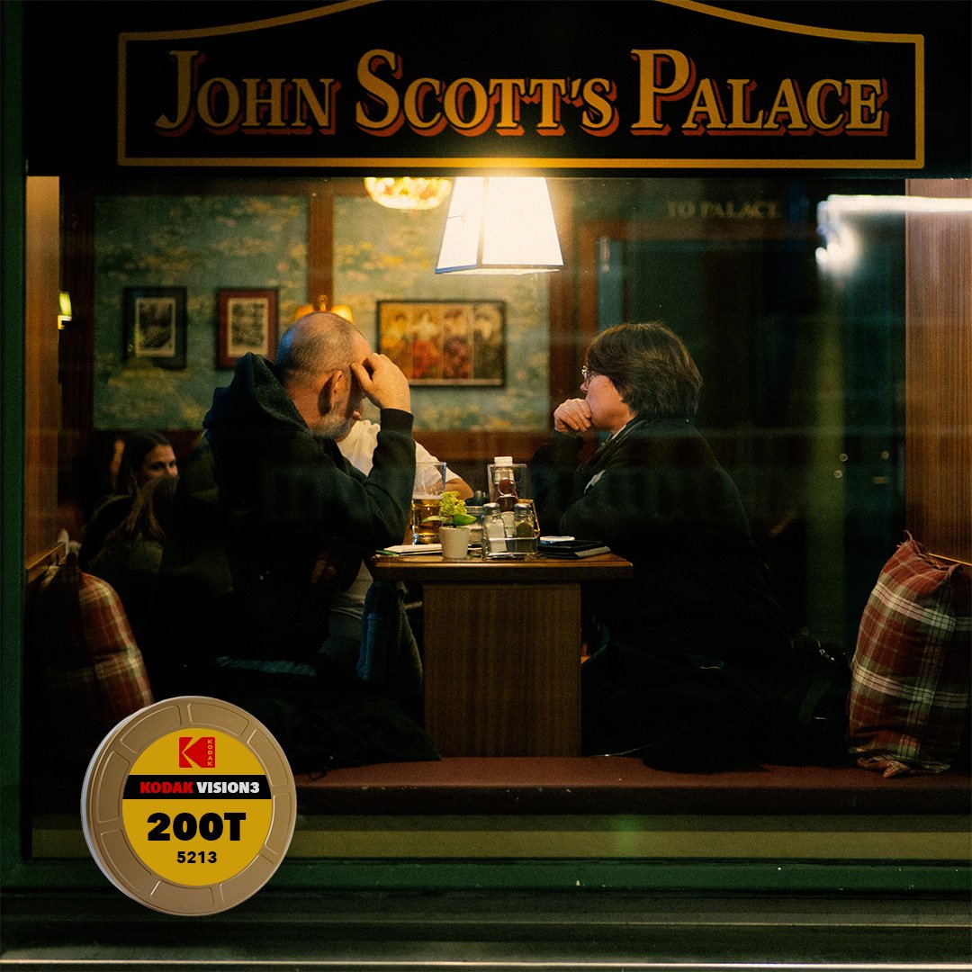
![Kodak Vision3 200t]()
Kodak Vision3 200t
Neutral-cool tungsten palette with clean blues and cyans. Restrained overall saturation with unmistakable filmic bias. Pair with Kodak 2383 for cinematic night scenes.
-
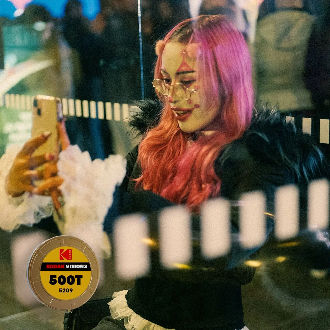
![Kodak Vision3 500t]()
Kodak Vision3 500t
Cinematic, slightly cool tungsten look. Rich shadows and moderate saturation. Pair with Kodak 2383 for added overall warmth, and its characteristic split tone.
4 Positive Media
-
![Fujicolor Crystal Archive type ii print paper]()
Fujicolor Crystal Archive type ii - print paper
Accurate colors, crisp blues and greens, and a punchy yet refined, modern look. Preserves the negative character while injecting a slight Fuji vibe.
-
![Kodak Endura Premiere Print Paper]()
Kodak Endura Premiere Print Paper
Neutral-to-warm paper with rich. Golden greens and yellows render an unmistakable Kodak character - even from Fuji negative stock.
-
![Kodak Endura Supra]()
Kodak Endura Supra
Consumer grade print paper with with very golden greens and yellows. This is the most characterful print medium we’ve profiled.
-
![Kodak 2383 print film]()
Kodak 2383 print film
Classic print-film look: warm highlights, cool shadows and slightly muted saturation. It bulldozes the negative character - see for yourself. Tweaking the white balance is key here.

Bonuses
-
Cinematic pack: 6 unique profiles that emulate classic print stock. These are artistic rather than scientific interpretations.
Color Boost: Brings subtractive saturation to Adobe Standard. Perfect when the vibrance slider doesn’t take you there.
Kodak 2383: two interpretations of this incredibly characterful stock. Low contrast and Standard contrast.
-
Whereas profiles are the base and do the heavy-lifting, presets are the cherry on top. There are 4 preset gr groups included:
Film Emulation: presets that build onto each of the negative stocks and bring them their full potential relative to what we collectively imagine they should look like.
Film components: Grain and bloom presets for convenience.
Film curves: Split tone and contrast curves representative of what we’ve come to believe a film stock should display.
-
This includes some raw files present in this web page. These files are for practice only. Quality results come from quality raw files.
Design choices
-
The profiles do not apply highlight rolloff or faded black point by themselves. We believe that is better accomplished using Lightroom curves to avoid imposing our guesses on you. The included film emulation presets and curves will support you on that aspect.
-
Clipping is good. We do not forbid it, so you can get help from Lightroom to visualize the blown out areas. Moreover, Lightroom’s built-in highlight handling algorithms is much better than can be accomplished with profiles alone.
-
We painstakingly calibrated each simulation to maintain middle grey as neutral as possible. For the most part we succeeded, so it is very easy to compare the effect of each profiles on the colors without annoying color casts.
-
Film saturation come from complex interactions between layers and dye couplers. We did simplify the models of these phenomena, which opened margin for interpretation. Therefore Kodak Gold 200, for example, was intentionally left with lots of saturation, whereas Kodak Portra was left more controlled.
-
Some profiles are similar to one another, notably Portra 800 and Ultramax 400. This was a bit surprising to us, but we follow the science wherever it takes us. Indeed, take a look at these stocks’ specsheets and compare the sensitometric data: it is surprisingly similar. Combining that with the removal of highlight rolloff and black fade, and our accurate middle grey calibration, we simply made it visually clear that these stocks have more similarities than differences.